Abbott Immunology Program Identity
A cross-event visual identity for Abbott's immunology programs: books of events, meeting collateral, and physician invitations in one brand system.
Abbott’s immunology division ran a national calendar of physician programs; each meeting had to look like Abbott, and like itself.
I built the visual system that made both true. One language, applied across a season of events (ACR, DDW, EULAR, and the Emerging Leaders series), so materials produced months and cities apart still read as one brand.
A system, not a one-off
The deliverable was never a single cover. It was a KIT: a book-of-events template, meeting binders, hospitality cards, program sheets, and physician invitations, all drawn from a shared grid, a fixed magenta palette, and the Abbott “A Promise for Life” signature.
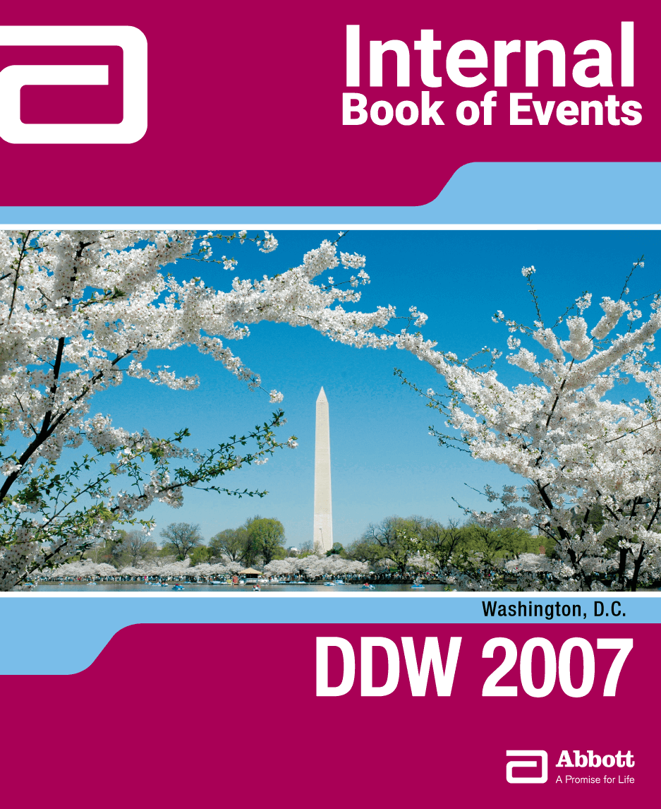
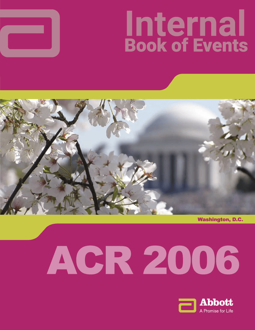
- Books of Events; a recurring cover series (ACR 2006, DDW 2007) pairing host-city photography with the immunology system.
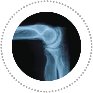
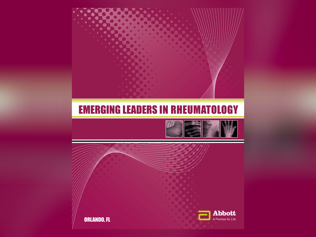
- Emerging Leaders in Rheumatology; a standalone program identity built on halftone gradients, clinical imagery, and condensed type.
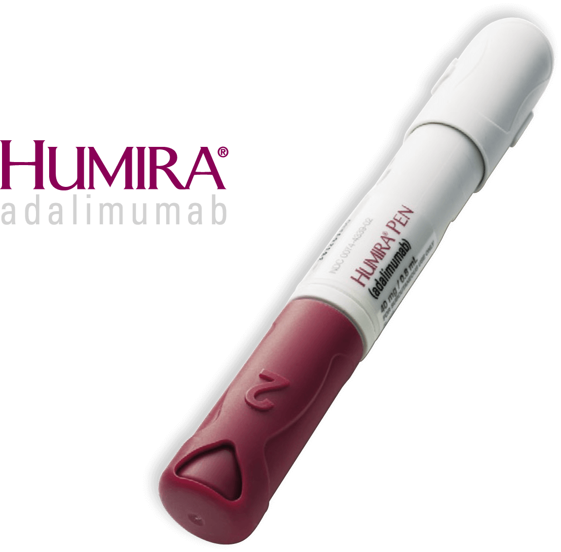
- HUMIRA presence; product-accurate imagery (adalimumab) placed to brand standard.
- Invitations; two registers for one audience, one quiet and editorial, one expressive.
Why it held up
Pharmaceutical brand work operates under scrutiny most design never sees; consistency there is not taste, it is control. The system removed guesswork, so each new meeting shipped fast, on-brand, and print-ready without a redesign.
Systems thinking, years before I had the vocabulary for it. The through-line to the performance work I do now is not a coincidence.
Gallery