cellhelmet Brand Refresh
The 2022 rebrand of a device-protection brand: a new interlocking-shield mark, a resolved wordmark, and a black-and-yellow packaging system.
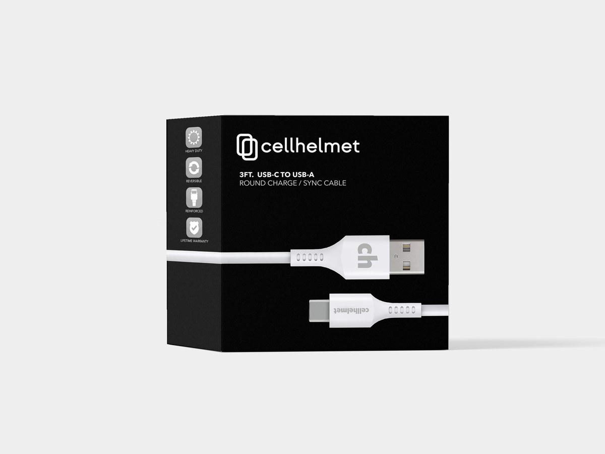
cellhelmet protects phones; the brand needed the same toughness the products promised.
I led cellhelmet’s 2022 rebrand. New mark, new wordmark, a full packaging system, and the motion to launch it; one identity, built to survive retail shelves and app screens alike.
The mark
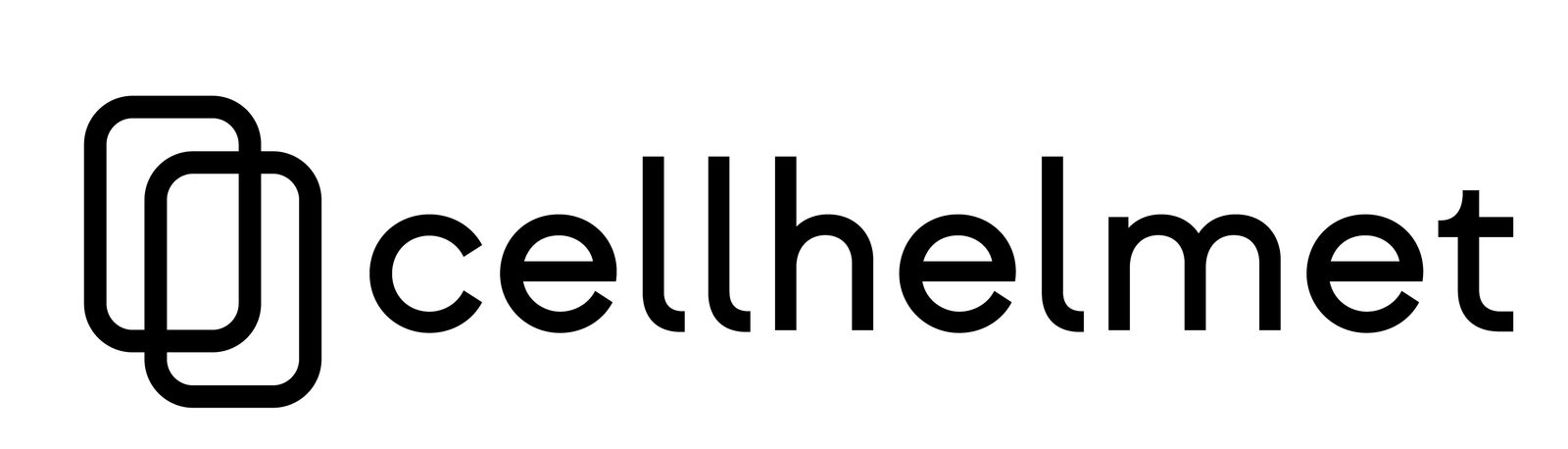
The logo is two interlocking rounded rectangles, a phone inside a shield, read as a single geometric monogram. It scales from a favicon to a shelf box without losing the idea.
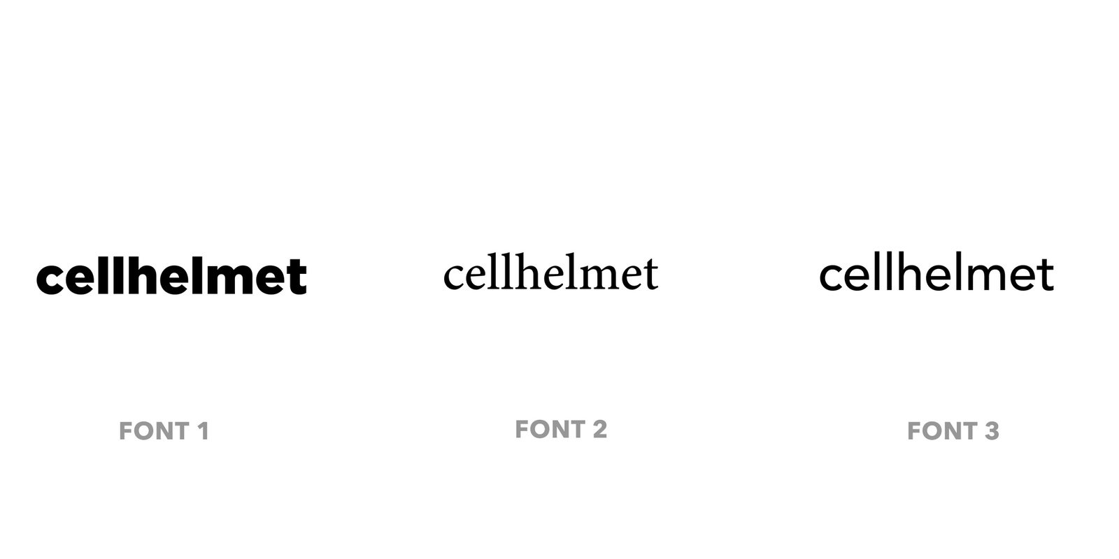
The wordmark took three rounds. (The comparison board is in the gallery; the lightest geometric route won.) Lowercase, even weight, no ornament; approachable, not aggressive.
The system
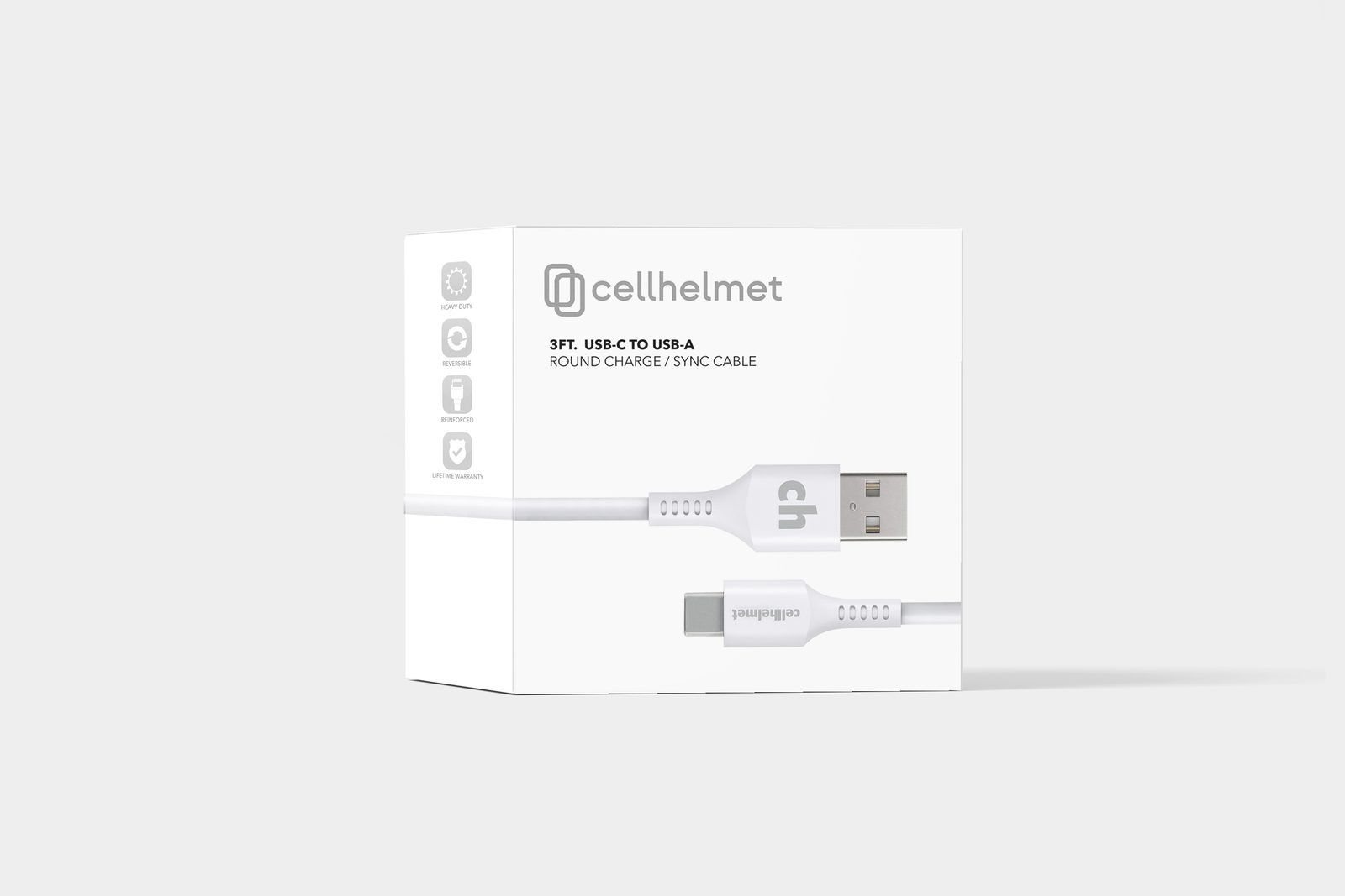
- Packaging; a black-and-white retail system with a fixed benefit-icon row (Heavy Duty, Reversible, Reinforced, Lifetime Warranty) so any SKU reads at a glance.
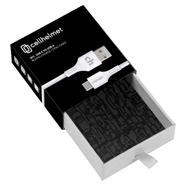
- Drawer boxes; slide-out packaging with a monogram-pattern interior, so the brand shows up even on the inside.
- Digital; an app icon and asset set that carried the identity, and the brand yellow, into the product.
- Launch; a motion reveal and social cut to introduce the mark.
Why it works
Accessory brands live and die on the shelf; a customer decides in the two seconds before they pick a box up. The system front-loads the promise, tough and guaranteed, into an icon row and a mark you can read from across an aisle. RETAIL is a design constraint, not a canvas.
The through-line to now: I still build systems that have to earn a decision in seconds, whether the surface is a retail box or a search result.
Gallery
Tools & Technologies
Services Provided
Deep Dive
Read the full case study →