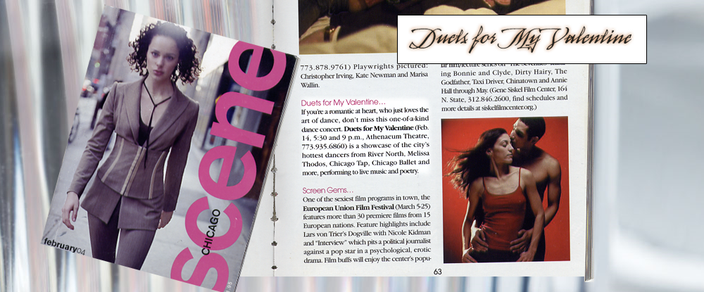
Duets for My Valentine
Brand and promotion for a Valentine's dance production: a stark black-and-white identity, poster and billboard art, and press for a show I produced.
Duets for My Valentine was a dance production I created and staged; I also built everything an audience saw before the lights went down.
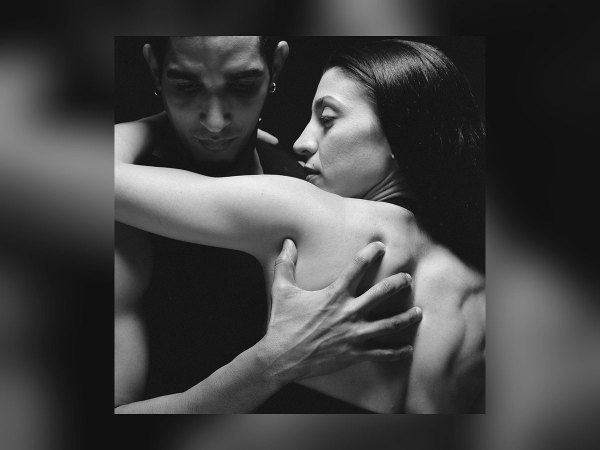
The brand had to do what the show did: make intimacy feel like an event. So the identity went stark, black-and-white, and close; two bodies and nothing else.
The look
Restraint on purpose. High-contrast performance photography, a quiet wordmark, and a lot of black; a Valentine’s show that refused to be pink. The image carried the emotion so the type did not have to.
The campaign
- Poster and billboard; the same intimate frame scaled from a mailer to the side of a building.
- Press; a feature placement in Scene, the identity holding up in someone else’s layout.
- Reader ads and web; a consistent look from the printed page to the screen.
I was the founder, the director, and the designer, which taught me the thing I still believe: the promotion is part of the WORK, not an afterthought to it.
Selling an experience before anyone has felt it, with nothing but an image and a promise, is the same problem I solve now for search and AI visibility; the stage changed, the job of earning attention did not.
Gallery