LifestyleApps Fitness Tracker UI
A landing page and app UI for an early nutrition and fitness tracker, designed to make daily health data simple to read and simple to act on.
LifestyleApps set out to make daily habits (what you eat, how you move, where your weight is going) simple enough to actually keep up with. The design problem was density: a lot of numbers, tracked every day, that had to stay readable instead of turning into a spreadsheet nobody opens twice.
I designed the landing page and the app interface around making that data feel light.
The design
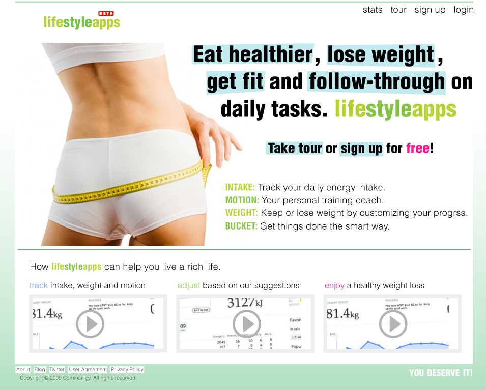
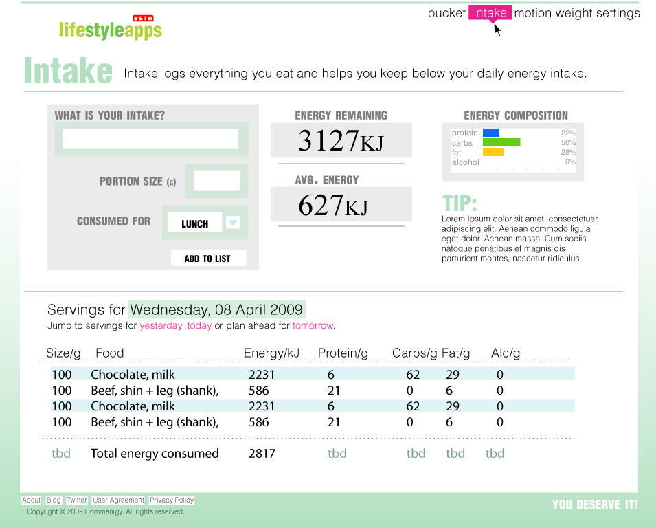
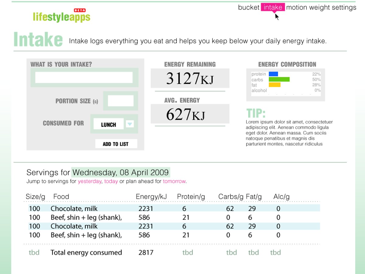
Structure over decoration. The core Intake screen put the one input (what did you eat) next to the one answer (how much energy is left), with a clean macro breakdown beside it, so a daily log took seconds and read at a glance. The landing page did the same job for the idea itself: what it tracks, in three plain steps, before it asked for a sign-up.
What it had to solve
- Make data legible; big, calm numbers and generous space so a glance told the story, not a squint.
- One input, one answer; the tracking screen paired the action and its result instead of scattering them.
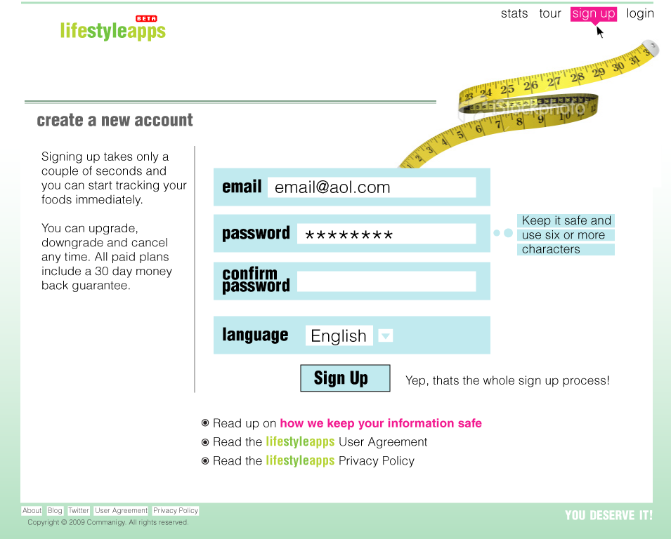
- A simple front door; the landing page explained the whole product in three steps before asking for anything.
Take dense, daily data and make it feel effortless, and people come back. That instinct, front-load the answer and cut the friction, is exactly what I bring to search and AI visibility now; different data, same discipline.
Gallery