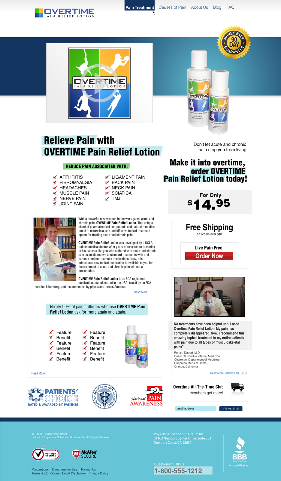
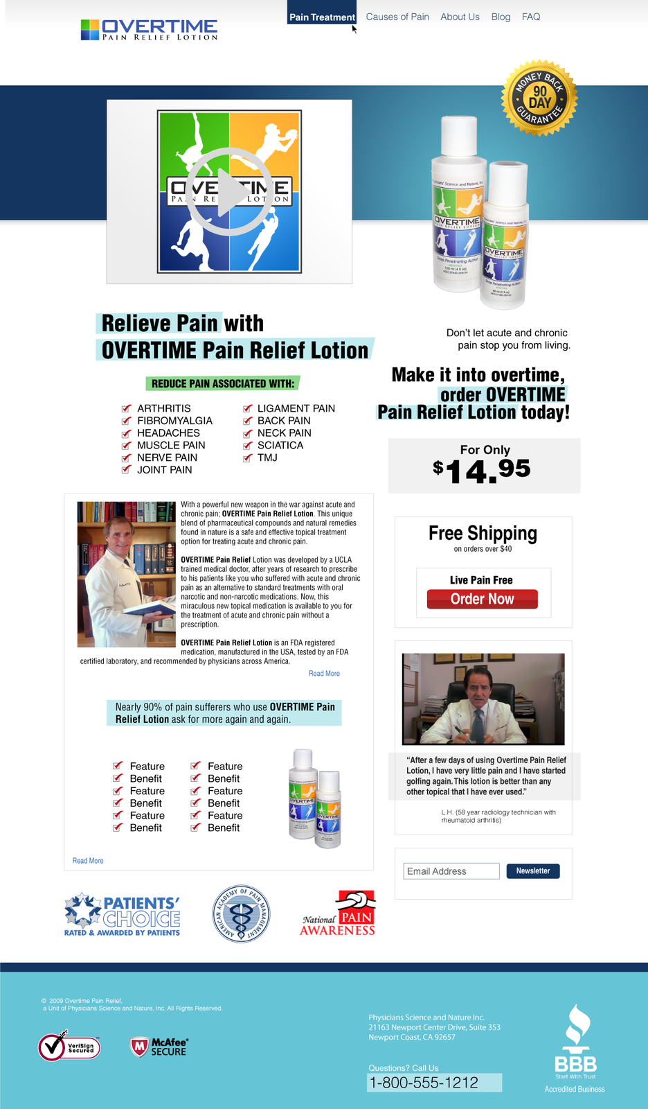
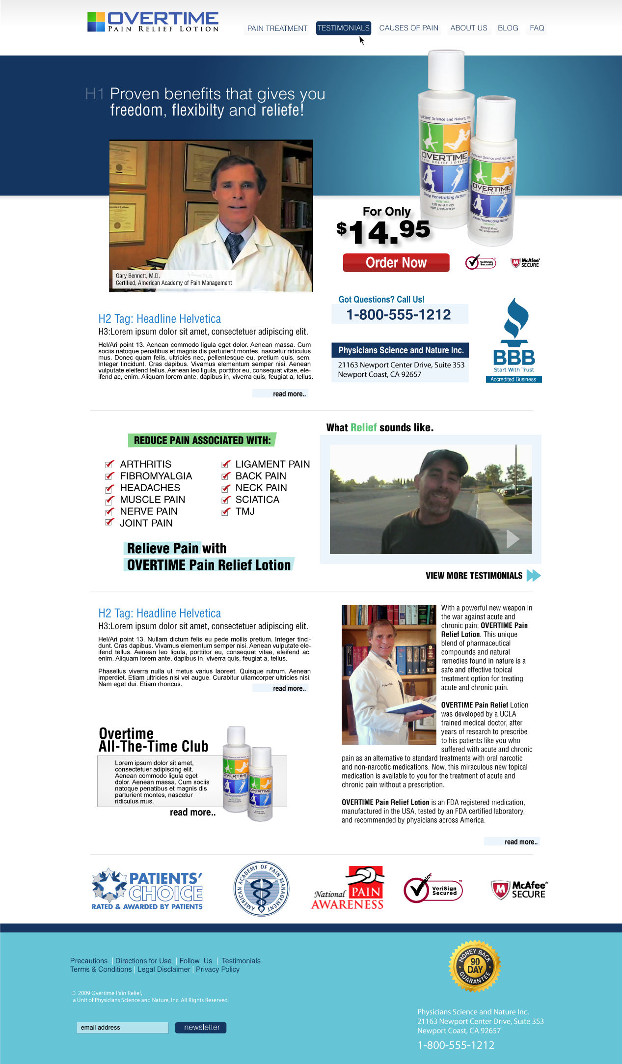
Overtime Pain Relief Landing Design
A conversion-focused landing page and site redesign for a direct-to-consumer pain-relief product: trust signals, a clear offer, and a testimonial-led layout.
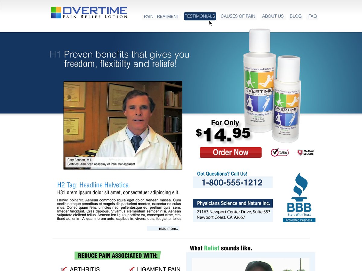
Overtime sold a pain-relief lotion directly to the people who needed it; the site had one job, turn a visitor into an order, and the old one was not doing it.
I redesigned the landing experience around a single question a buyer asks in the first five seconds: can I trust this, and what do I do next?
The layout
Everything pointed at the decision. A clear product offer up top, a physician testimonial to carry credibility, and the trust marks (secure checkout, accredited business) placed where doubt actually shows up, next to the price and the button. The structure did the persuading; the copy just filled it in.
What it had to solve
- Credibility; a direct-response health product lives or dies on trust, so the design led with proof, not adjectives.
- A single path; one primary action per screen, no competing calls.
- Scannability; headline, benefit, proof, action, in that order, so a skimmer still got the whole argument.
Conversion design is unglamorous and RUTHLESS: every element either moves the visitor forward or gets cut.
That instinct, front-load the answer and remove the friction, is exactly what I do now for search and AI visibility; the funnel got longer and the channels multiplied, but the job is still to make the next step obvious.
Gallery